E-Commerce Site
Super Sneaky Wholesale Division decided to expand their chanels from Wholesale to Direct to Consumer. For that, a new eCommerce site was needed under the brand name Low Overhead Hinges.
My Role
As the Founder of The Marketeer Canada and the main Web Designer, I created the designs, mockups and flows. I also created the full Store in the Groovefunnels platform.
The Product
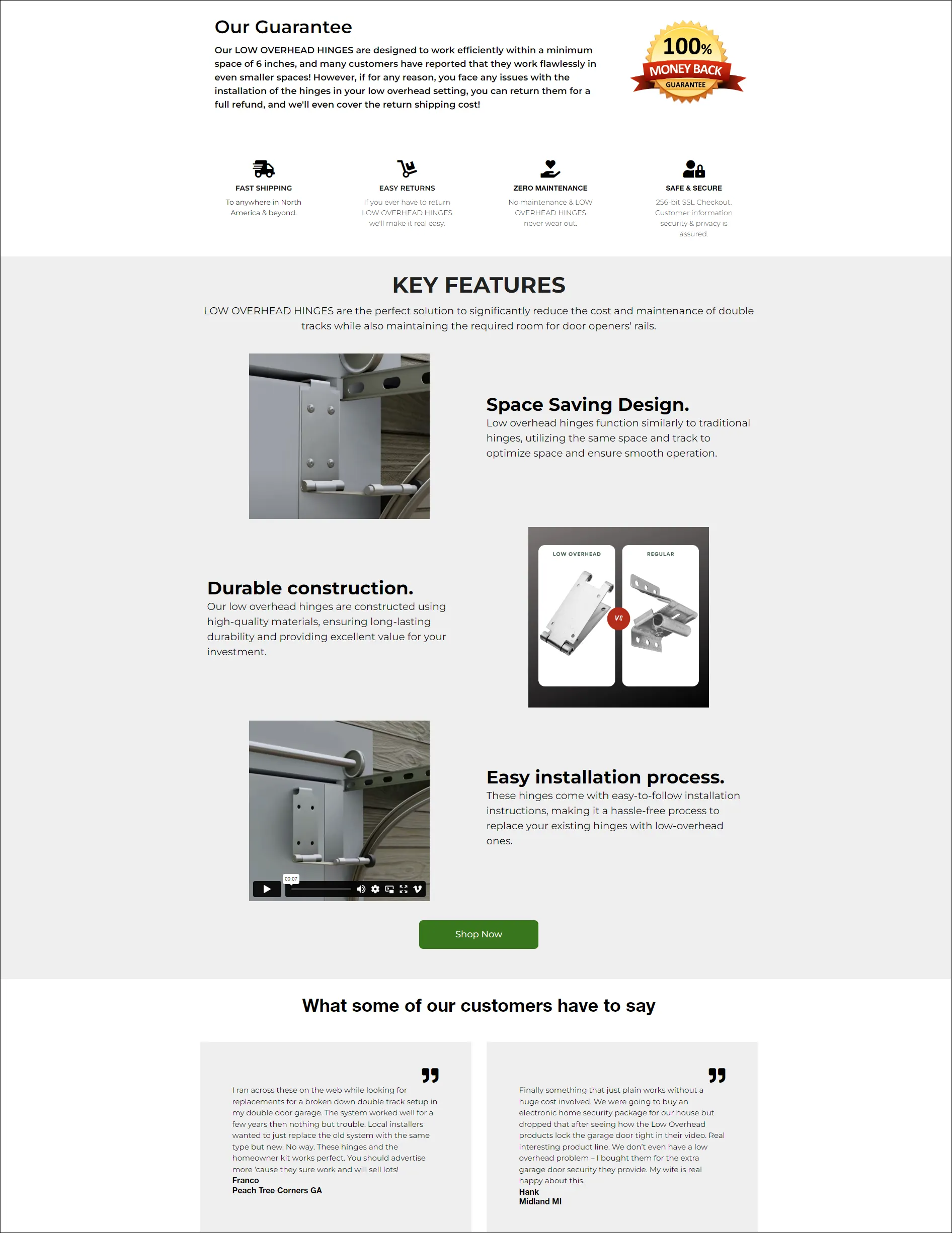
Low Overhead Hinges was specifically created for the homeowner who needed an easy, effective fix for the common garage problems of insufficient room to install an automatic operator, or faced the headache of an existing malfunctioning double-track system, or possibly worse still, was using potentially dangerous scissors type hinges.
These hinges are sold indivdually or on a bundle to help homeowners with low overhead, warped panels or weak panels.
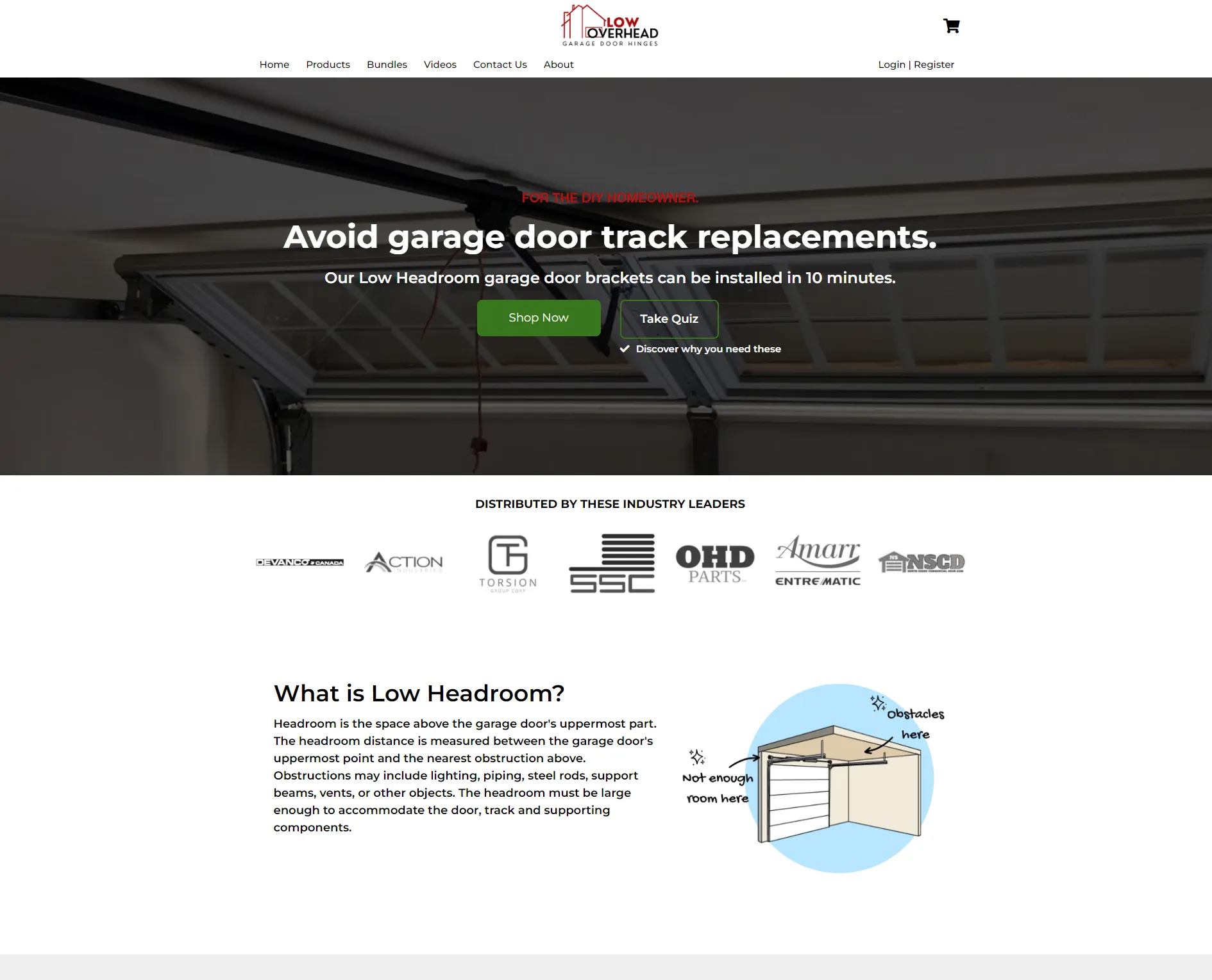
Headroom is the space above the garage door frame's uppermost part - the "Header". It is measured between the Header's highest point, and the lowest obstruction inside the garage itself, which usually includes lighting, support beams or joists, heating ducts for instance. Headroom must be large enough to allow the proper operation of the panel door. When it is less than 12" or so it is considered "Low Overhead" and requires special installation products for smooth door operation, or use of an automatic opener.
The Process
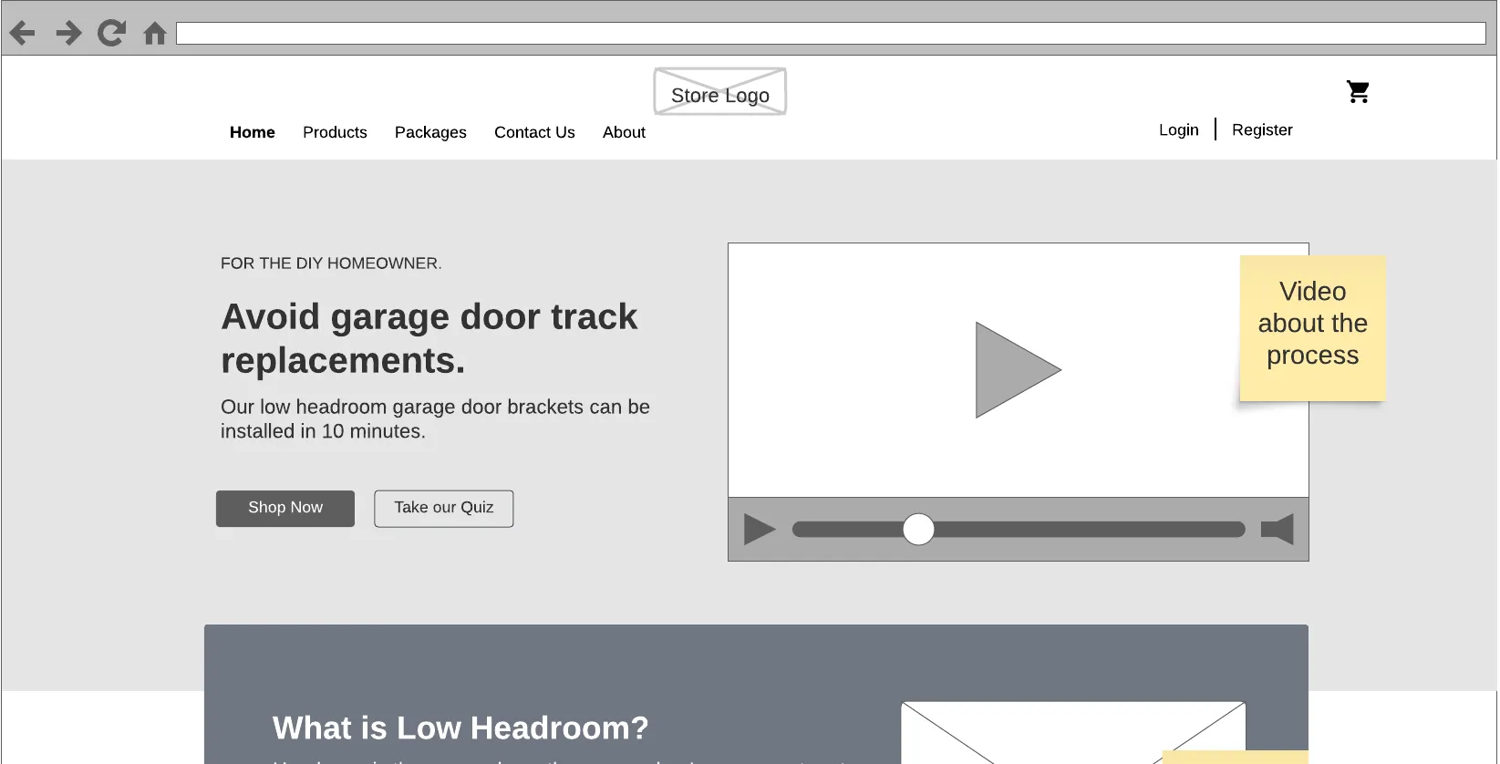
The process starts by crafting User Personas using a standard workshop and template. This provides visibility for both me and the client on many insights and language to be used throughout the Store.
Then, I create a Customer Journey for each Persona that will drive the flow of the store.
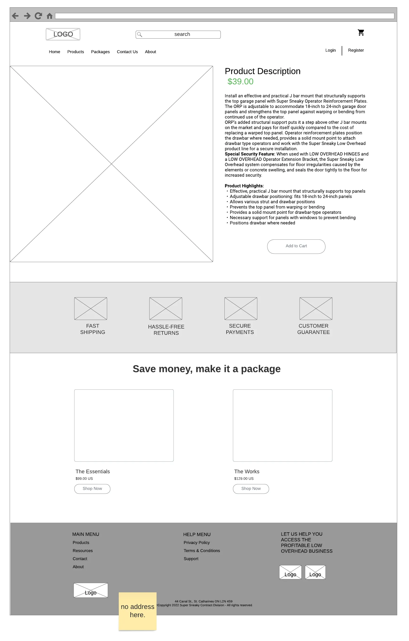
Once these 2 are complete, I create a Flow that supports each persona and their Journey finding products.
Product descriptions, pricing, discount coupons and Email templates were created to support the process. The store was also connected to payment gateways.
All screen sizes are optimized to allow for mobile clients.
Metrics
An average of 30 people per day started following the page.
In 2023 alone, there have been 10k visits to the Store.
Two Ads are running consistently and concurrently on Facebook and Instagram to allow for A/B testing.
Key Takeaways
An eCommerce Store is not a Website
Many people mix these two concepts and don't get the expected results. The layout and messaging required in an eCommerce Store should highlights the products and offers rather than what the Company does like on a Website.
Email Notifications are Key
Proper Emailing at every stage of the Purchasing and Delivery process is key to show the client that he hasn't been scammed and to be able to track their orders.
Simplicity over Complexity
Simple, clear messaging about the client's problem and what solution we are providing will land more clients when compared to complex or convoluted websites.
